a few words
This blog is an exploration of the interaction of different design disciplines. This ever expanding project is the main study of my MA on Graphic Arts+ Design at Leeds Metropolitan University.
This is an attempt to identify and record the major targets / experiments of this year's study. Research methods, design attempts and ideas, influences and links to other available material will be found here as well as future ideas and thoughts.
This blog should be the starting point of further thinking and exploration. Please feel free to comment and express your opinions on things you like or dislike.
search..
around the world
[Architecture]
[Graphic Design]
[Design]
[Blogs]
Labels
- Experiments (16)
- H Block (2)
- House X (7)
- Influences (11)
- news (1)
- Progress (17)
- Research (24)
- The Book (10)
- The Poster (3)
- The Table (15)
- Underpass (17)
news
Monday 10 September
..exhibition is up and running
Monday 03 September
..setting up the final exhibition
Saturday 04 August
..experiments on the H Block building
Monday 16 July
..first ideas and thoughts for the Book
Wednesday 11 July
..phase one of screenprinting on the Table
Thursday 05 July
..writting staff and designing the patterns for the Table project
Wednesday 20 June
..screenprinting tests for the Table project
Monday 18 June
..after a weekend in Asteris' workshop, the table is cut and ready
Friday 01 June
..The Table project starts
Wednesday 30 May
..playing around with photos
Thursday 10 May
..detail sketches of Underpass features
Wednesday 09 May
..a new idea for some form of publication on the Underpass design process
Friday 27 April
..concept volume model of the Underpass.
Tuesday 10 April
..massing model of the Underpass and video created.
Monday 09 April
..new layout design for this blog.
Monday 02 April
..The first layout for th Underpass project is issued.


5 comments:
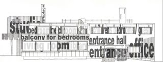
Another example of type application on buildings. This time on the original Technical Drawings (Elevation).
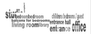
A representation of what is happening behind the surface of the building in terms of use of spaces. The viewer is able to understand the layout of the house before entering into it.
By substracting the drawing for type, we can see a composition of typographic elements (words) in a way that is instructed from the building setup. Therefore the type represents the building and could possibly be a standalone element for a graphical representation of its elevation. A typographical elevation.
Thanx for the info mamute. Valuable information. Please keep up dropping any comments, ideas, suggestions.
:)
its great to see monospace alive and kicking, explore things you really like, watching exciting results
cant wait to see more of the design process
check out
http://www.asymptote-architecture.com
cause its a wicked site with pretty good works
http://www.tschumi.com
theoretical works - manhattan transcripts for inspiration!
If this helps, lets make an interactive exchange of info since we are both mature students in terms of innovation and creativity
keep up the good work mono!
hehe :) thanx!
Post a Comment