hellopanos jump
Have you been wondering at all why this blog is not updated for so long?
Have you been wondering at all why this blog is not updated for so long?
Labels: news
The exhibition is up and running now. Hooray!
One week left for the assessment and next Monday we meet the external examiners for the last assessment.
So is it over?
Unfortunately yes.
I promised myself to continue working on certain subjects. There is still Colonel's Walk (the Underpass) that we are developing through Spawforths, amazonails that myself and Pandora are working and of course the book that I want to finish and print, so I guess it is not over yet. University is though and those great Wednesday brakes are sure to be missed.
I hope I will continue posting a few things every now and then, the progress of the book and the Underpass and any kind of interesting links for inspiring works around the world.
Let's keep in touch!
Labels: Progress

Avril Sanderson (landscape architect and part of Spawforths Urbanism team), did this beautiful image for Colonel's Walk (the Underpass) which, along with the rest of the document, is going to consultants for further commends.
Labels: Underpass

The Learning Agreement is done and handed in. After a few days of frustration and long hours in front of InDesign, it is all ready and gone in. There are obviously a lot of things that could be improved for such a document, especially in terms of presentation, paper choice and layout but it got to a stage that could be paused and presented, so I hope it is fine.
Now all focus goes to the setting up of the exhibition which starts in less than two weeks..
Labels: Progress


Some photos of the Table taken today at the photography studio at Leeds Met.
An extremely intimate moment with me and the table :)
Labels: The Table

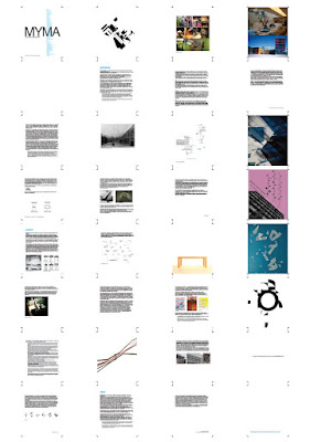
I am thinking of using the template that I have started designing, for the learning agreement presentation. Since the book is going to be presented as work in progress, then maybe this smaller document is a good chance to try it out. Here are some basic page layouts.

I moved today in the kitchen. Just to change room or whatever I see in front of me everyday. It is a bit frustrating being at the same place all the time, seeing the same things around you and hearing the same sounds again and again.
A small change I thought, which might result on either some ispiration (from the pans?) or some extra weight (due to the strategic distance between workspace and the fridge)..
The Learning Agreement is driving me insane!
Labels: Progress


This is a second idea for the exhibition poster. I am trying to represent both schools (Graphic Arts and Design + Contemporary Fine Art Practice) on the same poster by placing the title on two different typefaces.
The solid, clean and really defined type on the back is set in Politca, a clear sans font which has a lot similar properties with graphic design. On top of this I am placing type on a quite more abstract way that is identifying properties that are related with fine art and the freedoms that such a field has. This type is created by taking the original Helvetica letters and braking their snap points to more random positions, altering the type in a more abstract shapes with random outcomes (not particularly nice or eye pleasing).
The combination of these two types of type are showing somehow the unity and uniqueness of the school of Art at Leeds Met.
One idea could be screenprinting the two layers with two different colors. Maybe the bottom type (graphic design) could be in one of the basic CMYK colors whereas the top layer could be on a different tint of the same color establishing as well the expendable research and freedoms that fine art has opposed to the restrictions of graphics.
This surely does not try to place graphic design into a more trapped possition of lack of freedom or constraints but is more of an attempt to represent the similarities of these two disciplines (and the thin line that one becomes the other and so on..)
This is just another idea thought and maybe tomorrow is going to be something else!
Labels: The Poster