Monday, September 10, 2007

Exhibition


The exhibition is up and running now. Hooray!
One week left for the assessment and next Monday we meet the external examiners for the last assessment.

So is it over?
Unfortunately yes.

I promised myself to continue working on certain subjects. There is still Colonel's Walk (the Underpass) that we are developing through Spawforths, amazonails that myself and Pandora are working and of course the book that I want to finish and print, so I guess it is not over yet. University is though and those great Wednesday brakes are sure to be missed.

I hope I will continue posting a few things every now and then, the progress of the book and the Underpass and any kind of interesting links for inspiring works around the world.
Let's keep in touch!


Tuesday, September 04, 2007

The Underpass: Proposed Plan Sketch


Avril Sanderson (landscape architect and part of Spawforths Urbanism team), did this beautiful image for Colonel's Walk (the Underpass) which, along with the rest of the document, is going to consultants for further commends.

Friday, August 31, 2007

Learning Agreement


The Learning Agreement is done and handed in. After a few days of frustration and long hours in front of InDesign, it is all ready and gone in. There are obviously a lot of things that could be improved for such a document, especially in terms of presentation, paper choice and layout but it got to a stage that could be paused and presented, so I hope it is fine.
Now all focus goes to the setting up of the exhibition which starts in less than two weeks..

Wednesday, August 29, 2007

The Table: Photos


Some photos of the Table taken today at the photography studio at Leeds Met.
An extremely intimate moment with me and the table :)

Tuesday, August 28, 2007

Learning Agreement Layout


I am thinking of using the template that I have started designing, for the learning agreement presentation. Since the book is going to be presented as work in progress, then maybe this smaller document is a good chance to try it out. Here are some basic page layouts.

Manifesto


hmm not really, just a few sentences from the Learning Agreement that should be ready by Friday..

The Poster: Another Poster


Another idea for the poster. The two courses and.. the exhibition.

Sunday, August 26, 2007

.//


I moved today in the kitchen. Just to change room or whatever I see in front of me everyday. It is a bit frustrating being at the same place all the time, seeing the same things around you and hearing the same sounds again and again.
A small change I thought, which might result on either some ispiration (from the pans?) or some extra weight (due to the strategic distance between workspace and the fridge)..

The Learning Agreement is driving me insane!

The Poster: Another concept


This is a second idea for the exhibition poster. I am trying to represent both schools (Graphic Arts and Design + Contemporary Fine Art Practice) on the same poster by placing the title on two different typefaces.
The solid, clean and really defined type on the back is set in Politca, a clear sans font which has a lot similar properties with graphic design. On top of this I am placing type on a quite more abstract way that is identifying properties that are related with fine art and the freedoms that such a field has. This type is created by taking the original Helvetica letters and braking their snap points to more random positions, altering the type in a more abstract shapes with random outcomes (not particularly nice or eye pleasing).
The combination of these two types of type are showing somehow the unity and uniqueness of the school of Art at Leeds Met.
One idea could be screenprinting the two layers with two different colors. Maybe the bottom type (graphic design) could be in one of the basic CMYK colors whereas the top layer could be on a different tint of the same color establishing as well the expendable research and freedoms that fine art has opposed to the restrictions of graphics.
This surely does not try to place graphic design into a more trapped possition of lack of freedom or constraints but is more of an attempt to represent the similarities of these two disciplines (and the thin line that one becomes the other and so on..)

This is just another idea thought and maybe tomorrow is going to be something else!

Wednesday, August 22, 2007

The Table: Final Screenprinting


Today I spent the whole day at the Leeds Met Printmaking studios printing for the last time on the Table. This time it was the final part of the project (well almost) and we printed the data of the whole project (people involved, cost, dates, table data etc) on the four sides. It was a challenging process as we could not place the table on the printers so it had to be done on the floor. Dick and Sarah were there and once more they were of great help with all the printing. Unfortunately almost at the end of the day, while we were trying to print on the fourth side, we had a small accident and one of the legs came off! Nothing major though as the table is already in the woodworking studios and the nice people there will fix it for next week.
That’s all for now; back to the poster and the learning agreement..

Monday, August 20, 2007

Update/ The Poster


I am currently focusing on the writing of the Learning Agreement. I find it a bid difficult to identify the most important parts of this MA. Most of the experiences were (and still are) a vital part of the research and experimentations that I was doing all year.

I also started putting some ideas together for the exhibition poster for the MA Graphic Arts and Design course as well as the Contemporary Fine Art Practice in Leeds Metropolitan University.
The exhibition is going to run after the assessments for both courses which is the 20th and 21st September on H Block's 6th and 8th floor.

I will soon come back with some more ideas for the poster. Until then, just a first idea of basic typography. I particularly liked the character of this font (Politica) on its different weights. I believe it manages to promote the contemporary character of the course but at the same time, its clarity and legibility can also represent some of the core values of the course.

Saturday, August 18, 2007

Experiments: photos & vinyl


I keep on coming back at these photos. Today playing with vinyl cut and stuck on top of a print. The feeling of the mat vinyl on top of the glossy paper has some really nice qualities. I don't really know what I want to do with these photos but it is an interesting process.

you can see previous posts about them here and here

Friday, August 17, 2007

MYMA games pt.3


Just a couple of photos from my games with MYMA stuff..

Experiments: 2d photos revisited


I recently had a projector at home. It is great fun to see photographs and work in such a big size. All I did was to pick the camera and started shooting pictures in between the transitions of the slideshow. Some new grids? I love the results without any particular reason.

Here you can see the original post on the photos.

Friday, August 10, 2007

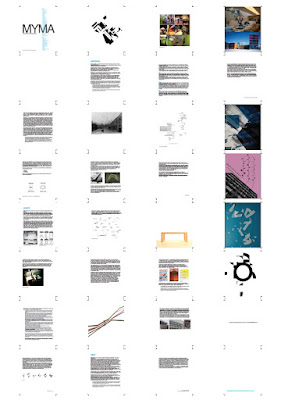
The Book: Layout (pt.2)

Another layout plan of the A4 format for the book. This time with worked out distances, grids and text sizes. Still developing..

Thursday, August 09, 2007

The Book: Illustrations

An almost complete list of illustrations for the book. There are a couple subjects still missing and the format of them is obviously going to change in terms of printing methods, sizes and shapes.

The Book: Layout

Possible variations of layouts on an A4 page. The grid is a simple grid that is formed of a 5mm edge around the page and a central grid line vertically on each page. The two horizontal lines are calculated from the golden section which manages to create a sense of calmness and legibility.

After a lot of thinking on the size of the book publication, testing different formats and page sizes, I come up to the dicision of most likekly going for A4 (page size). The basic standard size of A4 (210x297mm) is really easy to use, place, read, hold and get familiar with. I feel that any other kind of dicision for random shapes would be quite decorative and is something that wouldn't compliment my work. I have not came up with a final dicision though so we shall see..

Monday, August 06, 2007

Books layouts

Some book spreads from the three books mentioned below. Studies of grids pictures relating to text, different font sizes, hand-drawn sketches, architectural plans, photographs.

Sunday, August 05, 2007

Three books

Trying to find intresting books for inspiration, what better choice can someone have but looking at these three great publications. Truth is I have never been able to read them all but I think this is part of them too. They are great sources of inspiration, books that you can easily open randomly and read jumping around sections and chapters. The information can be read in various ways, linearly or randomly, refering from page to page and to different subjects / section. There are hidden stories to be discovered, clues to understand and look for more. Parallel stories or short narratives that develop in secret ways (and grids).
I am particularly enthousiastic about the ways that they manage to hold all this information (they are 1330+, 440+, 530+ pages each). Obviously I won't even try to get up to these sizes (I don't even have so much work!) but I would be interested on designing the book in such a way that can be read in different ways.

Saturday, August 04, 2007

the building (pt.2)


a short video with the H Block letters..

link to H Block Publication blog

the building (pt.1)

H Block, Leeds Metropolitan University

link to H Block Publication blog

Saturday, July 21, 2007

The Book: Contents layout

One of the most important maps of the year, this is the book layout and chapter map. A basic version where the seven red chapters are the main ones (see link) and the light blue are the additional chapters/ sections. A basic outline of what should be included in each subject, is also noted as well as some basic questions for the articles that are needed to be written. This map should be extended and developed in the future, to include all upcoming subjects and sections of the publication.

MYMA games pt.2


a few photos from the pt.1 poster